Youth Wellness Lab
Position
Product Designer
Location
Toronto, ON
Date
10/2023 - 07/2024
Platform
Website
Tools
Figma
Framer
Method
Research
Information Architecture
Ideation
Wireframe
Prototyping
Project Management
Project Overview
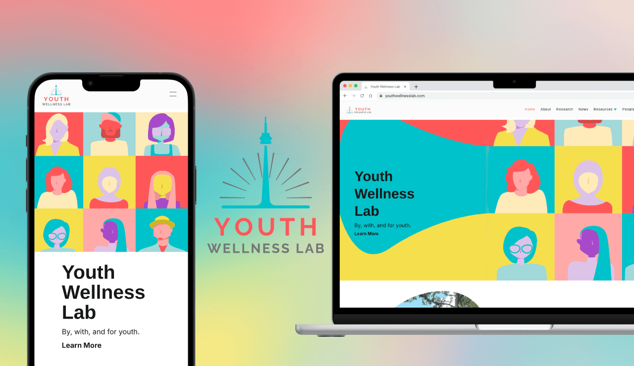
As Product Designer, I led the redesign of the Youth Wellness Lab website to better engage teenagers seeking resources while maintaining professional credibility for sponsors. Based on audience research, I established a new visual direction with a vibrant color palette, sans-serif typography, and improved information architecture. I then designed wireframes, user flows, and 50+ high-fidelity screens, iterating with stakeholders in an agile process. The site was built and launched in Framer, delivering a WCAG-compliant, responsive platform that boosted views and click-through rates by 50%.
Client Overview
The Youth Wellness Lab (YWL) is a research collaborative that brings together youth, academic researchers, and community-based partners. Its mission is to improve services, resources, and outcomes that directly impact young people, while also engaging sponsors and stakeholders who support this work.
Link to Youth Wellness Lab's Website
Project Goal
Redesign the website to improve readability, usability, and overall information architecture.
Showcase YWL’s professionalism with a polished, credible, and accessible design.
Engage youth audiences with an approachable look that encourages resource use and research participation.
Research & Analysis
To understand the foundation of the redesign, I first met with the lab owners to discuss their vision, identify the primary audiences, and clarify the website’s core objectives. From there, I conducted a deep dive into the existing site, reviewing its color scheme, information architecture, imagery, and accessibility. The analysis uncovered major challenges — including poor readability from a dark palette, confusing navigation, and inconsistent visuals — all of which highlighted the need for a design that was not only more user-friendly, but also credible and appealing to both youth and professional stakeholders.
Missing global footer reduced overall site usability.
Youth-Led Resources required unnecessary clicks, with no shortcuts to sub-sections.
Ambiguous labels (e.g., “Youth-Led Resources”) made it unclear what content users would find.


Thin body font and poor color contrast (white on bright blue) hurt readability.
Inconsistent aesthetics: misaligned color palette and uncoordinated UI elements.
Lack of visual consistency across pages (e.g., alternating black and white backgrounds).
Project and Youth-Led Resources pages were unclear in purpose without additional explanation.
Sub-page “The Latest” nested under Projects added further confusion for users.

Previous Information Architecture

Updated Information Architecture

Visual Design
To maintain brand consistency, I kept YWL’s existing red and blue as the primary and secondary colors. Building on this foundation, I researched design trends appealing to younger audiences, focusing on Gen Z’s preference for vibrant, high-contrast palettes. I introduced brighter accent colors and sans-serif typography to make the site feel more approachable, while ensuring accessibility through improved contrast ratios. This refreshed visual identity balanced youth appeal with professional credibility, aligning with YWL’s dual goals of engaging young people and presenting as a trustworthy research organization.
Moodboard

Color Palette

Typography

Solution
The old website lacked a global footer, forcing users to rely solely on the top navigation and creating friction when exploring deeper pages. I added a global footer to establish consistent navigation across the site, providing quick access to key sections, resources, and contact information. This not only streamlines user flow but also enhances credibility by reinforcing YWL’s identity and accessibility at every page level.


Previously, the Youth-Led Resources tab required users to click into the main page before accessing sub-sections, adding unnecessary steps to navigation. I redesigned the global header to include dropdown menus, allowing users to directly access sub-pages. This reduced friction, improved clarity, and created a smoother navigation experience across the site.
The old navigation used ambiguous labels, such as Youth-Led Resources, which were unclear to first-time visitors. I simplified this label to Resources for immediate clarity and added a Collaboration tab to highlight YWL’s partnerships. These changes not only improved usability but also enhanced the site’s credibility by showcasing the lab’s professional connections.
I also renamed The Latest to News and elevated it to its own tab in the global header, making it immediately recognizable and accessible.
To reduce confusion caused by ambiguous pages, I added a short introductory paragraph on each page to clarify its purpose and content.

Heuristic Evaluation
Prior to launch, I conducted a heuristic evaluation together with a UX professional, identifying and addressing usability issues to ensure the website met accessibility standards and delivered an intuitive, professional user experience