Website Redesign Project:
Next Gen Men

Course
INF2192 Representing UX
Role
Project Manager
Date
01/2024 - 04/2024
Platform
Website
Tools
Figma
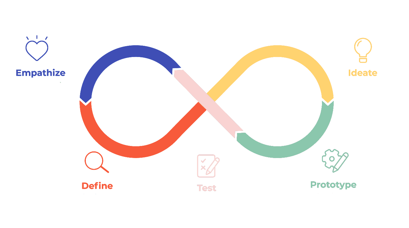
Method
User Research
Interview
Think Aloud
Ideation
Information Architecture
Prototyping
Usability Testing
Project Goal
The project's objective is to revamp the website of Voice Male Magazine so that it reflects the brand identity of Next Gen Men. The redesign aims to preserve existing user engagement while also attracting a broader and more diverse audience. Additionally, the project will address known issues to enhance the overall user experience.
Client Overview
Next Gen Men, a profit organization based in Canada is dedicated to reshaping traditional views of masculinity and empowering boys and men to embrace more diverse identities. They recently acquired Voice Male Magazine, a standing pro-feminist publication in North America since 1983. Redefining masculinity ideals and promoting equity are shared goals of both organizations.
Approach
Problem Statement
Voice Male Magazine's outdated design contrasts sharply with Next Gen Men's modern aesthetic, creating a disjointed user experience. Overlapping features, such as donation and subscription options now managed by Next Gen Men, add to the navigation challenges.
Problem Analysis
Presently, Voice Male Magazine sports an outdated design, starkly contrasting with Next Gen Men's vibrant, high-contrast aesthetic(Voice Male Magazine, n.d.). This disparity disrupts user experience.


The overlapping features between Next Gen Men and Voice Male Magazine like donation and subscription options, which now fall under Next Gen Men's purview(Next Gen Men, n.d.).

The footer appears outdated and unhelpful for user navigation.

User Research Method
In order to identify the pain points of Voice Male Magazine's website. We've designed and conducted 7 semi-scripted interview with the stakeholder of Voice Male Magazine and Next Gen Men, including subscribers of Voice Male Magazine, subscribers of Next Gen Men, and executives from Next Gen Men.
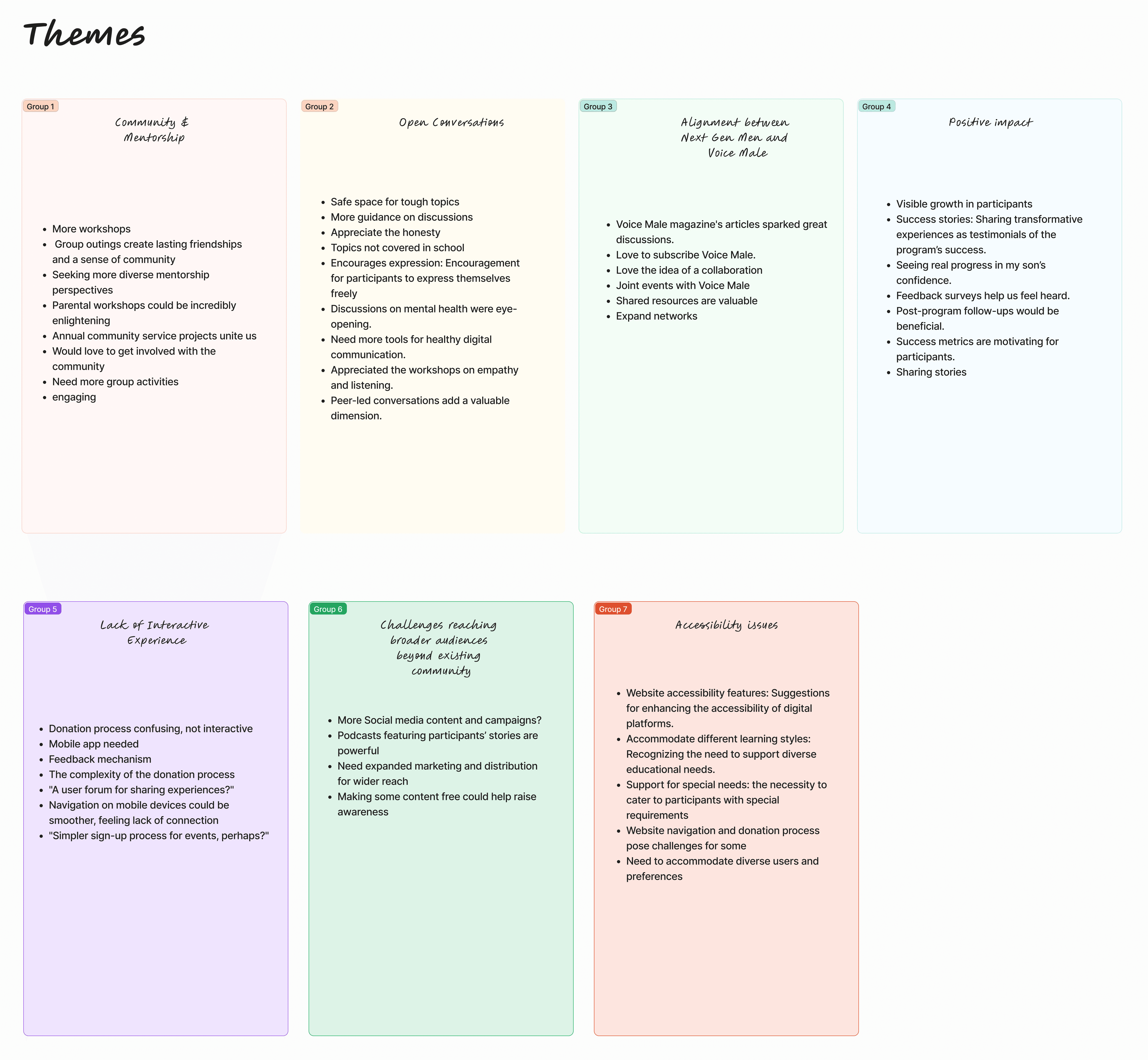
Data Analysis
In our analysis of Next Gen Men's program feedback, we employed an affinity diagram to systematically organize and interpret qualitative data. This process involved five key steps:
Data Collection and Organization: We began by gathering feedback from participants and breaking it down into individual observations for detailed examination.
Pattern Recognition and Theme Identification: Next, we grouped related observations to identify emerging patterns, abstracting these into broader themes that captured the essence of the feedback.
Constructing the Affinity Diagram: Using the identified themes, we created an affinity diagram. This visual tool helped us spatially arrange the data, facilitating a deeper understanding of the relationships between themes.
Refinement and Insight Derivation: We then refined our themes and extracted key insights, ensuring they accurately reflected the feedback and highlighted areas for improvement.
Translating Insights into Action: Finally, we translated these insights into actionable design implications, identifying specific strategies that Next Gen Men could implement to enhance its programs.
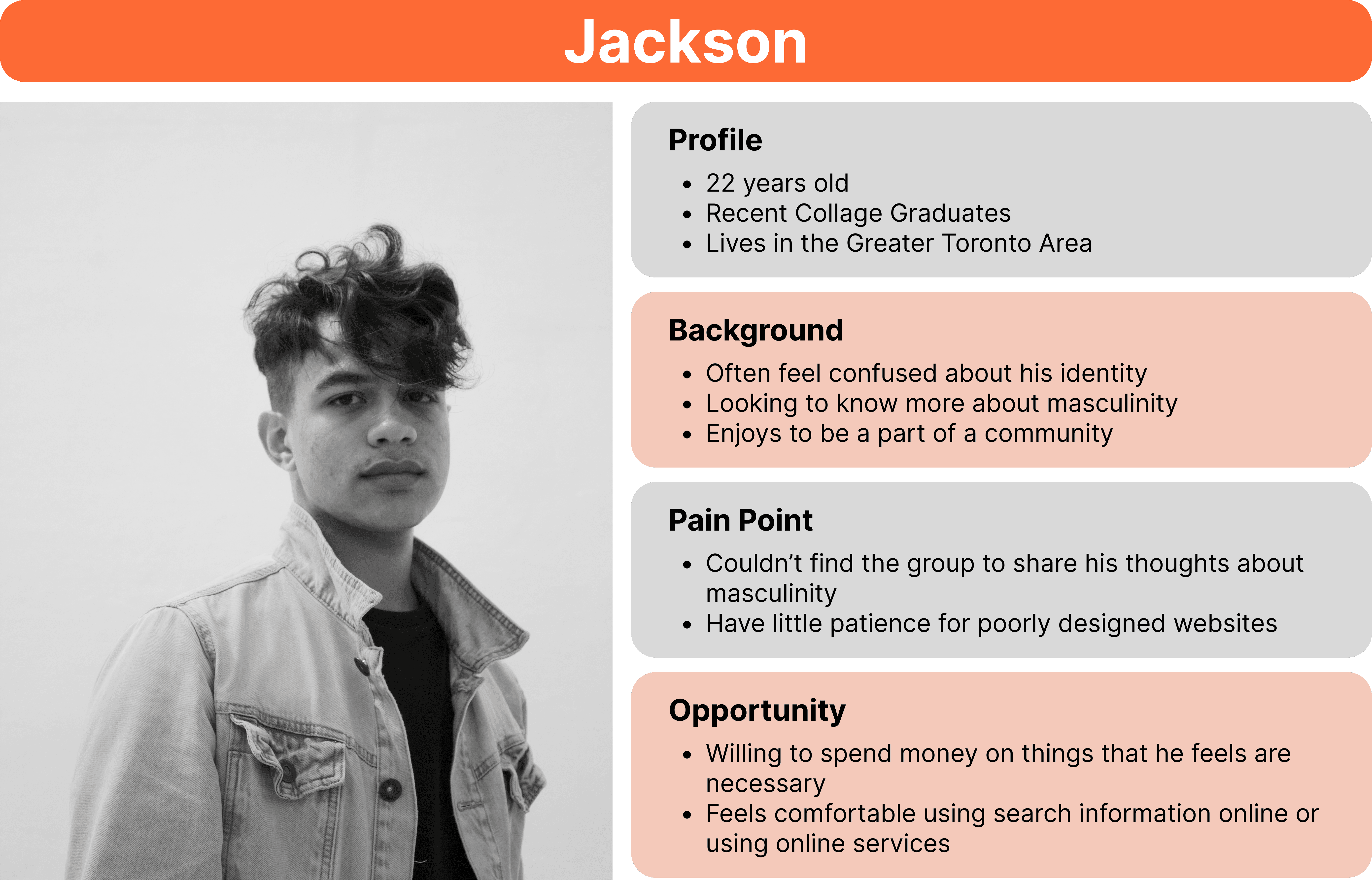
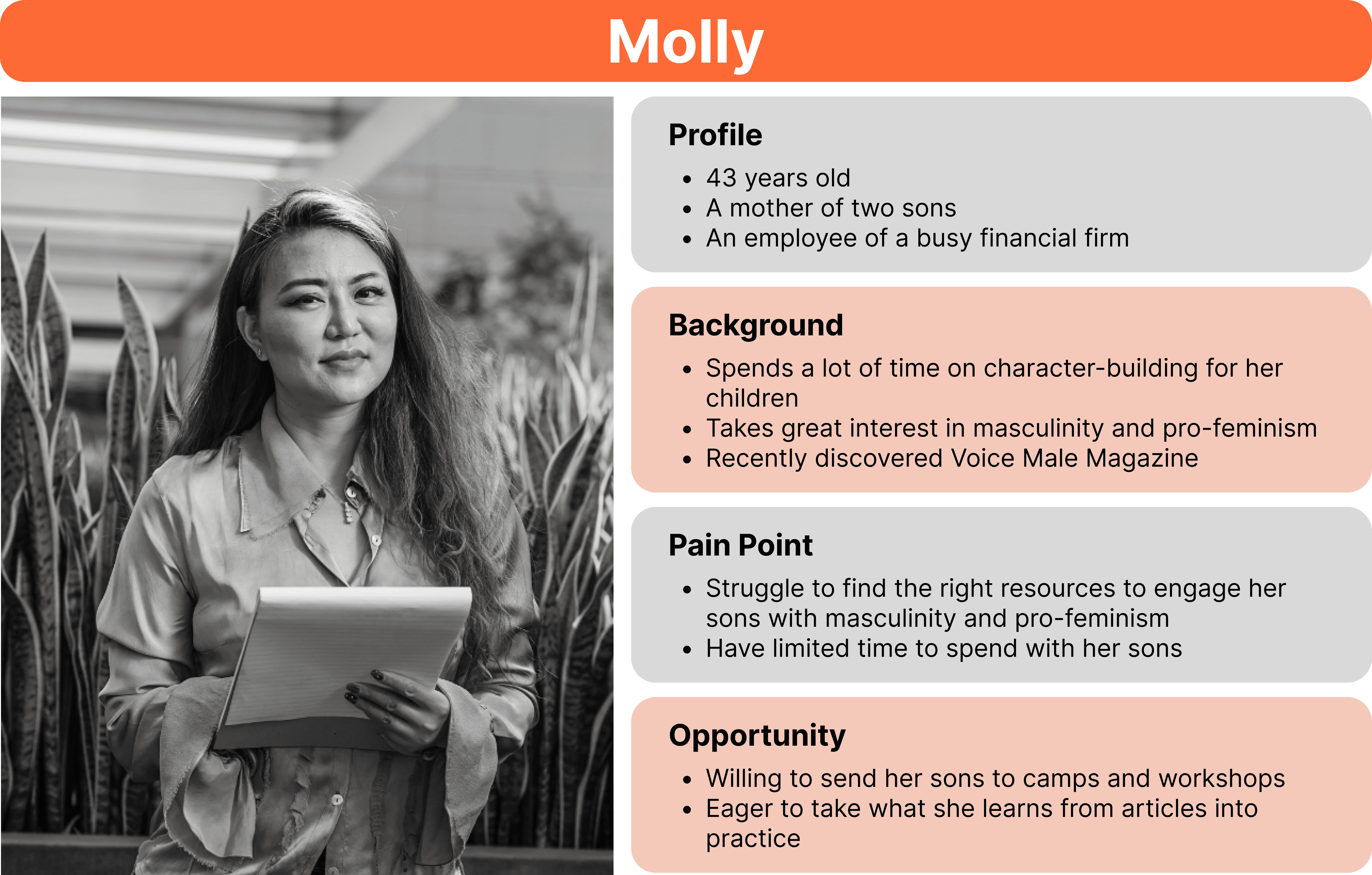
Persona
Based on the user research, we've generated 3 personas.

As-is Scenario
Based on the personas, we've created an As-Is Scenario to demonstrate the user journey with current Voice Male Magazine and Next Gen Men's website.

(Scroll to see full content)
To-Be Scenario
After empathizing with the user, we have created a to-be scenario to address the identified pain point

(Scroll to see full content)
Solution Overview
To unify user experience and brand identity we redesigned and integrated Voice Male's website under Next Gen Men's aesthetic, ensuring coordination in color, typography, and design across both platforms. This redesign aimed to simplify navigation by streamlining content and user interactions such as subscriptions and donations.
The integration plan maintained Voice Male Magazine’s identity, carefully merging it into Next Gen Men’s platform while preserving its unique perspective and readership. The update simplified donation and subscription processes and improved clarity in navigation to enhance user experience.
Finally, the project sought to expand audience engagement for Voice Male and promote Next Gen Men membership, employing targeted strategies to attract a diverse demographic and foster active participation in content and support initiatives across both platforms.
Moodboard

Style Tile

Hifi Mockup: Current Design v.s Updated Design
Home Page
We kept the layout of the home page but redesigned the UI to match the UI design from Next Gen Men's website.

(Scroll to see full content)
About Us Page
We added a new section introduce Next Gen Men and added a new CTA section at the bottom to encourage Voice Male Magazine's user's engagement with Next Gen Men.


(Scroll to see full content)
New Publication Page
We added a new publication page to contain all the published issues.

(Scroll to see full content)
Issue Page
We updated the UI design while added a new CTA section to redirect user to NGM's website.

(Scroll to see full content)
Article Page
Same as the Issue page, we updated the UI design while added a new CTA section to redirect user to NGM's website.

(Scroll to see full content)
New Resource Page
Because NGM is acquiring Voice Male Magazine, the resource page now is wired to NGM's library. Therefore users are now redirect to utilize the resources provided by Next Gen Men.

(Scroll to see full content)
New Donation Page
Based on client's request, we've designed 4 donation options with detailed explanation of each option.
(Scroll to see full content)
New Donation Guide Page
From the interview, we learnt that many existing Voice Male Magazine's subscribers are less tech-savvy. Therefore we created a thorough donation guide to support them. And the guide can be found in the footer.

(Scroll to see full content)
Usability Testing
We've designed and conducted 4 semi-structured usability testings. In conclusion, participant feedback has underscored the strengths of the platform's user interface and navigation, highlighting its consistency and ease of use. However, several areas require attention to enhance user experience and clarity, including modifications to the Home Page, Landing Page, and Donation Guide, among others. Additionally, suggestions aimed at improving the appeal of publications and increasing transparency on the Donation Page have been offered. Addressing these high-fidelity prototype fixes and client suggestions will not only refine the platform's functionality but also potentially increase user engagement and trust in the Next Gen Men initiative.
More Project


© Kehan Tan 2025