Website Redesign Project:
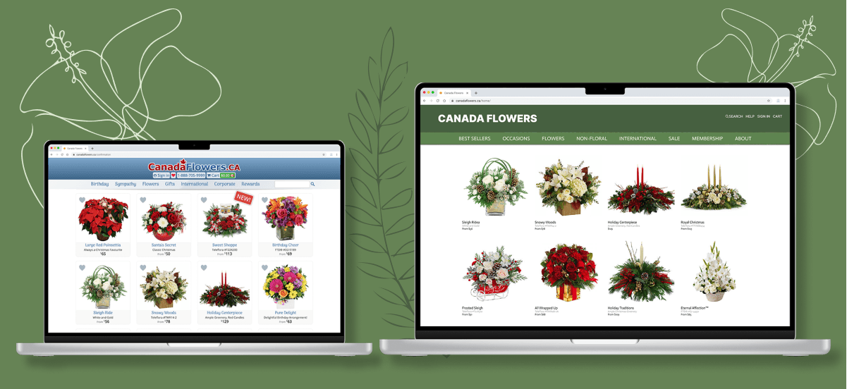
Canada Flowers
Course
INF2170 Information Architecture
Role
Date
09/2022 - 12/2022
Platform
Website
Tools
Figma
Photoshop
Content Inventory
Card Sort
Tree Test
Method
Researching
Information Architecting
Interaction Design
Visual Design
Prototyping
User Testing
Presentation
Project Overview
Improve user experience on CanadaFlowers.ca by redesigning its Information Architecture and user interface.
Problem Statement
The issues with organization include redundant categories, categories that are not mutually exclusive, hidden subcategories, delivery information needing to be set individually, and a lack of notifications when orders change. The issues with labelling include labels that do not consistently reflect category contents, labels that are ambiguous or needlessly complicated, icons that do not reflect content, and duplicated labels.
Approach
Our initial data is collected by conducting usability testing and interviews with three potential customer of Canada Flowers. Based on our analysis, we were able to identify the IA structural problems. We then conducted card sort and tree test to locate the problematic category and provide redesigned IA Structure. The graph below outlines our design process.
I was responsible for design and conduct the usability testing, interview, and co-design the card sort test and tree test.

Content Inventory
Content inventory is essential for us in terms of structuring and improving the information architecture of a website. For CanadaFlowers.ca, it involves documenting categories in forms and analyzing content like static HTML pages, images, and tables. Images, particularly in JPEG and PNG formats, are crucial as they first engage users.
The website features a main navigation for access to sections like flowers and gifts, supplemented by a search function and a chat feature for immediate customer interaction. Sub-navigation appears upon hovering over menu items, offering quick access to categories and reducing page views.
Despite efficient navigation, the site faces issues like duplicated content and pages in unknown languages. Conducting a thorough content inventory can help identify redundancies, categorize related content, and optimize high-value pages for better performance and search engine optimization, thereby enhancing user experience and site quality.
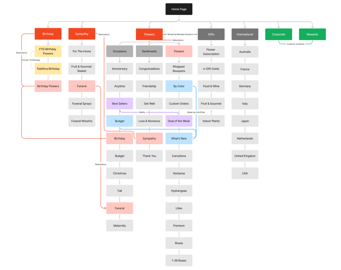
Current IA Structure
Initial Usability Testing
In order to identify the issue with Canada Flowers website, we conducted 3 usability testings consist of Think Aloud task with a follow up interview. As our preliminary research identified, our primary focus when improving the IA of CanadaFlowers.ca will be to improve the labelling, organization, and navigation systems. This was confirmed by the usability tests and interviews we performed, as our representative users all indicated that these three systems are inadequate in their current state. Beyond these three systems, the representative users also indicated that the aesthetics of the website, the current presentation of delivery information, and insufficient descriptions all tarnish their perception of CanadaFlowers.ca and make them less willing to consider the website as a viable flower retailer. Therefore, for our redesign of the existing IA of the website to be successful, we must not only look at the systems we were able to identify in advance, but also these factors that affect the users perception of the website.
Card Sort
To enhance the user experience on CanadaFlowers.ca, we are employing both behavioral and attitudinal research methods. We initiated a card sorting study, complemented by observational methods to monitor how participants interact with the website. Following the card sorting, we conducted brief interviews to gather insights into participants' experiences and their perceptions of the site’s organization. This approach helps us understand users' expectations of an ideal online flower store. Ultimately, we will compile both qualitative and quantitative data from these activities for detailed analysis.

The table lists all cards used in the study, highlighting changes made to certain website labels for clarity. "Custom Orders" was changed to "Custom Flowers" to specify that the service involves flowers, not other gifts like wine or food. The "Thank You" label was renamed to "Appreciations" after initial confusion among participants during card sorting. Additionally, the category "Gifts" was altered to "Non-floral" to address past user feedback about the overlap with the "Flower" category. The "Sentiments" category was removed due to confusion with "Occasions," simplifying it to just "Occasions." These changes aim to refine CanadaFlowers.ca’s information architecture and enhance user understanding.
Updated IA Structure
Based on our findings, we redesigned the information architecture (IA) of CanadaFlowers.ca by eliminating redundant labels and ensuring labels accurately reflected their contents. We reorganized categories for clearer navigation and understanding. Improved navigation made it easier for users to identify and explore these categories with their updated labels. Additionally, we introduced a filtering tool to sort categories by price, color, and other relevant characteristics. After enhancing these core systems, we focused on secondary attributes, such as updating the website's aesthetics and clarifying product information and delivery details.

Tree Test
For the tree test, we developed ten different tasks. We received feedback from 26 potential users that served as our participants. Our tasks mainly focus on the master categories of the website. In order to make sure our tree tests were understandable for users, we designed two rounds of tree testing, including a tutorial tree test and five regular tree tests.
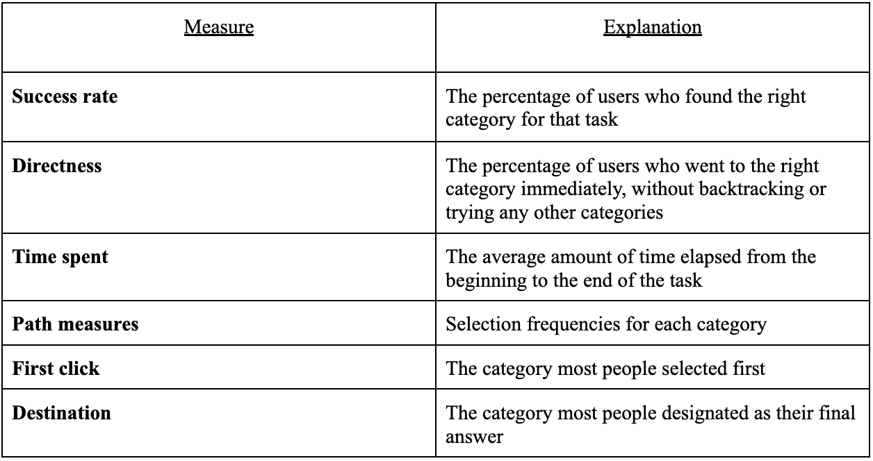

The task "You want to buy flowers for your partner to celebrate the 5-year anniversary. Where would you go to find the ideal items?" was correct only 29% of the time, we did not see any need for changes to the navigation bar. Because of the analysis results, the participants chose "Roses, Anniversary, Congratulations, I Love You." The meaning of these answers all represent love, because everyone has different perceptions of love. So we think these answers are within the reasonable range. This also proves that our navigation bar can satisfy different users to purchase flower arrangements.

Especially, if the reason for buying flowers is because of a certain festival or some special event, there is a 50% probability that the user will go to the flower navigation to confirm, instead of directly choosing the occasion. We're guessing that since this is a flower arrangement site, users browse the “Flowers” category first. The main purpose of users browsing this website is to buy flowers, either from the category of "Flowers" or "Occasions." So we are going to change the position of "Flowers" and "Occasions," and put the categories of "Occasions" and "Flowers" side by side. This will help users save time and we believe users will be more satisfied if they spend time browsing these two categories. Because the flower arrangement designs in different scenes come from different designers, these designs may not be well recognized by users. They can compare and get the most suitable flower arrangement by browsing flower categories.
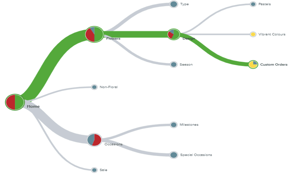
Overall, the tests showed a success rate above 75%. Results for directness varied significantly, ranging from 0% to 100%, with corresponding times from 3.75 seconds to 51.8 seconds. The "Deals of the Week" category was the most efficient, achieving 100% directness and the quickest time of 3.75 seconds. Conversely, the "Custom Orders" category was the most challenging, with the lowest directness (0%) and the longest time (51.8 seconds). In the "Custom Orders" path, users often mistakenly navigated the "Non-Floral" and "Sale" categories before finding the correct category.
Therefore, we decided to keep the labels the same because most of the tasks have a success rate of over 75%. In other words, the labels are understandable to the participants, and should therefore be understandable for users. The directness of some tasks is below 50%, so users may just want to browse around to find if there is a more suitable category and most of them can eventually find the correct category. Therefore, we would like to reorder the categories "Flowers" and "Occasion" to make the navigation more efficient as we mentioned above
Website Redesign
There are also few user experience issues that caught our attention.
Warning Message for Product Replacement
Our research shows users are likely to overlook this information due to the font size and text location.
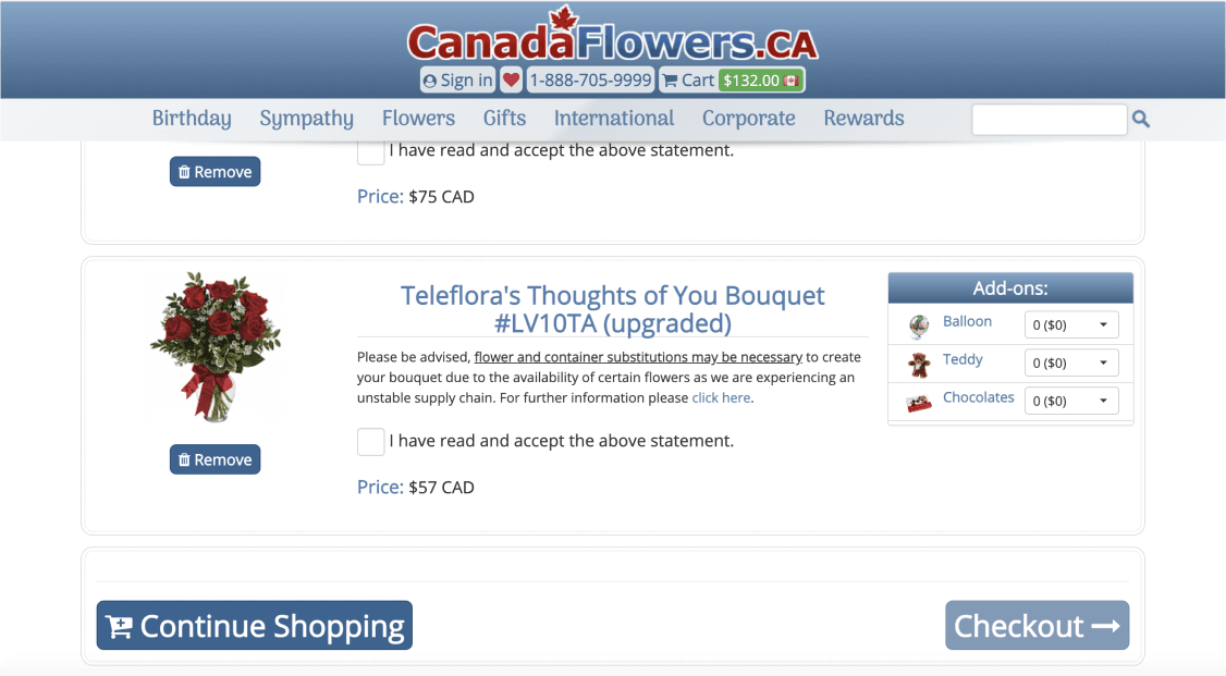
Therefore, We used the pop-up window to draw customer’s attention to this message, in order to minimize and avoid their confusion when receiving a replacement due to unstable supply chain.

Warning Message for Product Replacement
User need to fill in their delivery information every time for different items.

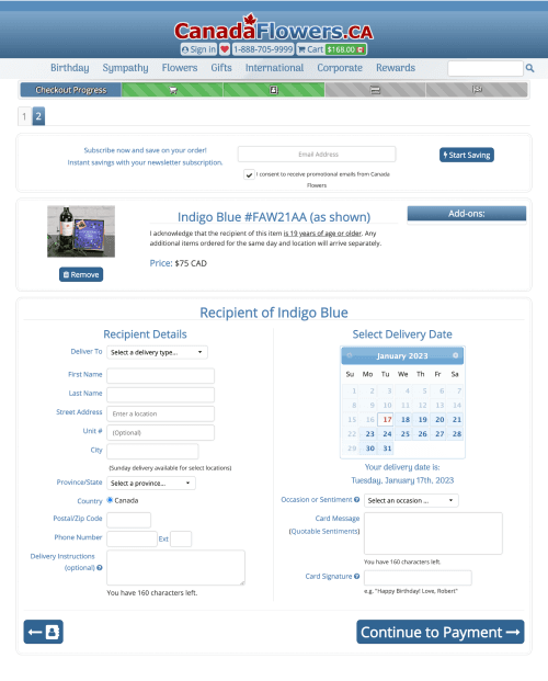
If user wants their items delivered to the same address on the same day, they don’t need to enter repeatedly. The redesign minimizes user’s chance of making mistakes, saves their time and energy.


Outcome
We identified issues with the organization and labeling systems on CanadaFlowers.ca and developed a prototype to address these concerns. Our prototype redefines master categories, eliminates redundancies and hidden categories, and allows users to apply the same delivery information to multiple items in their cart. Additionally, it warns customers about potential supply chain issues that could affect delivery times or product quality before they complete their payment. The prototype also updates the labeling system to align with the organizational changes and address broader labeling issues.